 1300 382 777
What’s Hot In Web Design in 2015
How web design trends have changed in the last 15 years! Back when I started as a web designer in 2000, Flash sites were all the rage, lack of high speed internet meant images were used sparingly and no design could be wider than 768 pixels. Flash forward to now and the world is a veritable web designer's paradise; anything we can dream up in terms of design and functionality can be easily brought to life. This means the envelope is continually being pushed and this is fun for everyone.
So what's hot in 2015 when it comes to web design trends? I have nine things to offer:
1. Full page images on the home page
I personally love this trend (and naturally, we've embraced it fully on our own site). Internet speeds nowadays means you can drop a huge image (and even a gallery of huge images) front and center on your home page. This is hugely impactful, looks great and is magic from a branding point of view as it allows the designer to put the company's value proposition right in front of the new visitor and it doesn't have to compete with anything else. But … will the user scroll?
2. Scrolling scrolling scrolling
Yes the user will scroll! Long gone are the days where you had to put all the important stuff 'above the fold' because users were reluctant to stroke the wheel on their mouse. Nowadays people will scroll vertically, they'll scroll horizontally (if you make them … I don't recommend it) and there's even parallax scrolling which isn't 'necessary' from a functional point of view, but is nice from a design point of view as it adds an element of 'depth'.
3. Whitespace
Because people are willing to scroll and we no longer have to try and cram the '10 super-important things any visitor to this site needs to see' into a 768px wide x 400px odd high space … we designers get to go crazy with whitespace these days. What is whitespace? It's space between the elements on a page (as opposed to 'heaps of white everywhere').
Whitespace:
- Allows all elements on the page to breathe.
- Reduces tension between those elements.
- Allows you to highlight the important things without resorting to big coloured splashes and arrows.
- Creates balance and harmony.
If you've landed on a website and you don't know where to look first, it's probably because the designer hasn't used whitespace very well. If you feel like your eye is being led naturally from one element to another … that's an indication that they have.
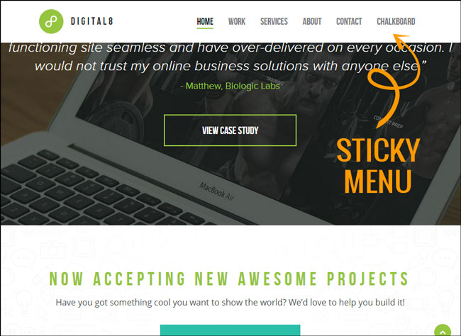
4. Sticky menus
These are good. They are the menus that stay at the top of the page as you scroll down the page. Given how willing we are to scroll these days (see above), they are a very practical and functional element that pretty much every website should have.
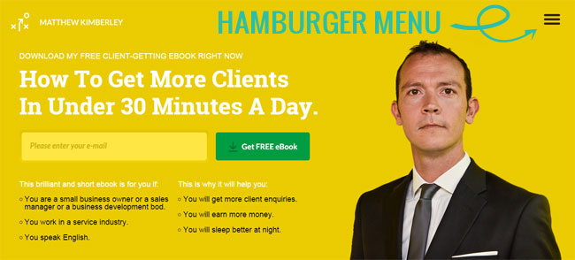
5. Hamburger menus
These are horrible. They are practical on mobile devices but for some reason they're also creeping into desktop designs too. There is just no need. People want and expect to see your entire menu laid out for them across the top of the screen. Give people what they want. People are not yet so used to hamburger menus that they will search around on the screen for it. If you make a visitor to your website search for something, you've already lost them.
6. Big fonts
Our desktop screens are bigger and we're doing a lot more reading on them these days. It's very tiring on the eye to read on a screen so we're making the font size for body fonts and heading fonts much bigger now. 14 pt is good, 16pt is better (depending on the font) for a body font. And we’re putting a spacing of at least 1.65 between lines of text. There's no need to make people squint at a screen anymore!
7. Killer imagery
Stock imagery is such great quality and so well priced these days, there is just no excuse to have terrible imagery on your site anymore. And because our internet speeds are faster, we can go big and high impact with our imagery. This is great for everyone: designers, their clients AND the people viewing websites.
8. One page websites
Gosh I hated these when they first became a thing, but I'm far more sold on them now, especially if you have a site with very little content or if you're trying to tell a story. Many sites are now using a 'one page' feel on the home page of multi-page sites as this ensures that if the viewer doesn't get past that page, they're still walking away with a solid feel for what the brand is all about. (NB: If you have SEO goals that you plan to achieve with a website then this can change whether or not a single page site will work for you as they can unfortunately dilute relevance of information as opposed to a multi-page website)
9. Fully responsive design
Not only is this a thing (responsive design means your site will expand to fill a full desktop screen, and contract when on mobile), it's an essential thing after Google's 'mobile-friendliness' update earlier this year. It just makes for great user experience when a website displays in exactly the best way possible for the device it's being viewed on … and that's what responsive design accomplishes.

Kelly Exeter is the owner of Swish Design, a boutique web and graphic design company in Perth, Western Australia. She is also editor of Flying Solo, Australia's largest online community of solo and micro businesses.
Are you ready to grow your business?
We write about a variety of topics in the digital industry.
