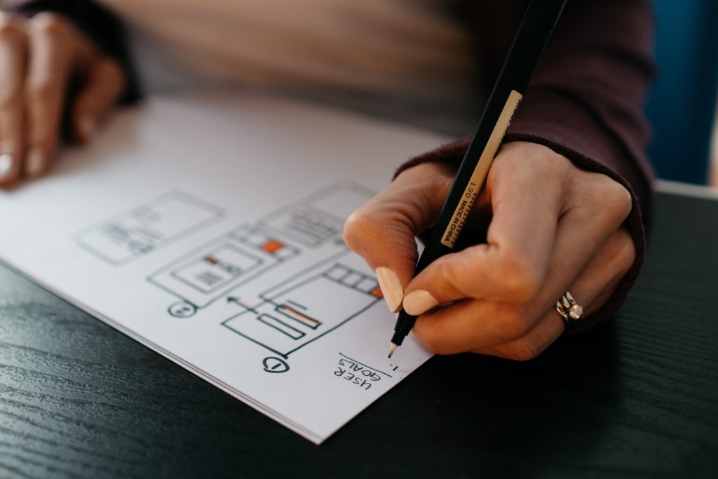
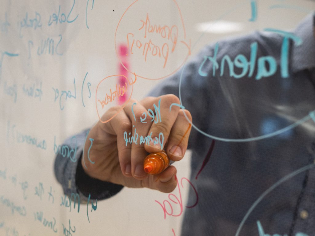
With the ever-growing number of websites, design tools and possibilities, it is very likely that you will find yourself drowning in information. Trends and fashions are constantly changing, so your website will have to comply and stay up-to-date in order to be received well. What should you include, what should you leave out, and what will make the visitors of your website have the best possible experience? This guide illustrates the 6 trends that are most apparent in website design for 2018.
Need to kick off a website project but don't know where to start? Try out our briefing template.
1. Moving content
Moving content is the absolute biggest trend in 2018. The rise of animated content has already appeared in previous years, but the trend is continuously growing. The increase of tools that enable designers to easily create animated content, developments enabling browsers and apps to easily read and display moving content, and the seemingly inexhaustible human need for entertainment all contribute to the growth of this trend. Additionally, it is a natural trait for human beings to notice motion, making it an extremely advantageous feature for designers. In 2018, you will find that websites will encompass a variety of moving content, including cinemagraphics, particle backgrounds, integrated animations and micro-interactions.
Cinemagraphics
Cinemagraphics, or rather the use of video or GIF based visuals that appear in a continuous loop, will create an immediate interest in a page or website. If the cinemagraphics are placed and used in the right way – say it is used as a background on full-screen size, with possible other content laid on top of it – it will draw the visitor’s attention to the visuals, without them being consciously aware of it. The visual then aids the delivery of the message that you are trying to get across. Also, not unimportant to note, the use of the right video can result in more sales. Consumers have shown to be 85% more likely to purchase a product after seeing a video featuring that product. So, adding a short but informative video to your website is definitely worth the extra effort.
Particle backgrounds

A good alternative to using a full screen video as a backdrop for your website would be a particle background. Particle backgrounds are dynamic backgrounds that load faster than videos, are generally less distracting, but are still eye-catching. With these features, a particle background sounds more advantageous than a video background, which is why this trend will be something we will see more of this year.
Integrated animations
Not just screen-filling motion-based visuals are a thing. Many designers have started integrating smaller animations in their websites. These animations range from animated illustrations and logos, to animated typography. The animations can be used to steer the attention of the visitor to certain features of the website or to tell a story and represent the personality of the company – the latter can be supported by animated illustrations. Keep in mind, the animations are there to guide your visitor through the website. Just like the particle backgrounds, animated illustrations minimise the website loading time – which minimises the chances of visitors leaving before the website has fully loaded.
Micro-interactions
Lastly, micro-interactions are a big thing in web design this year. Micro-interactions can best be described as ‘user-focused animations’. These subtle animations are responsive to user actions and are used to enhance the user experience. Additionally, the animations are used to trigger action from the visitor, making them undertake action when and where you want them to. Examples of micro-interactions include drop-down menus and lit-up texts that are triggered once a cursor hovers over the object.
2. Eye-catching typography
Typography has always been a powerful tool in design, as it combines both textual and visual content. Typography is one of the features that has the power to illustrate and generate sentiment, as it is able to provoke emotion and convey messages in whichever way you want them to be conveyed. As a result of device resolutions becoming sharper, visuals become easier on the eye, and fonts become easier to read. This development has opened doors to the wide variety of options in typographical design.
The bigger, the bolder, the better

In 2018 we will see that headers and other textual content will become even bigger than what we have already seen in the past years. Even though this looks like a trend that has developed simply because it was received well, there is actually a more practical reason for it. For SEO, headers are crucial to the proper functioning of the concept, as well as the fact that headers aid the organisation of information from the visitor’s perspective. Therefore, it seems only logical that designers have started playing with the looks of their headers.
The ways in which headers and other textual content can be designed, seem to be limitless. We are already seeing an increase in hand-drawn fonts, animated typography, and even typography cut-outs. The latter is one worth mentioning as it combines the aesthetic of photography with the art of typography. Typography cut-outs usually consist of transparent fonts, displaying a photograph or other visual through the font. So, look out for new trends, as designers will be getting more creative in their typographical designs in 2018!
The return of Serif
Whereas in the past years the use of sans serif fonts has been heavily credited, the use of serif fonts is actually making a comeback in 2018. Contrasting sans serif fonts against big headers in a serif font can help emit a sophisticated image. The use of both sans serif and serif fonts on a webpage creates a dynamic user experience, which engages the user by taking advantage of their inherent need for entertainment.
3. Bold and vibrant colours
The time in which black and white colour schemes are a thing is officially coming to an end. The simplicity of black and white colour schemes seems to be losing to the upbeat vibes that saturated colour schemes bring about. Because of technological advances that brought us screens with the ability to reproduce richer colour schemes, vibrant colours will be used more often in web design.
Vibrant, saturated colour schemes

The use of vibrant and clashing colours is a way for web designers to capture the immediate attention of a page visitor and making the website stand out from others. If you are looking for a way to set yourself apart from your competitors, or simply do not want to be ‘one of those’ companies, the use of vibrant and saturated colour schemes can help portray such an image. Combining the use of these colours with the use of asymmetrical aspects within your design provides an opportunity for designers to show their creativity.
The use of these colour schemes can be presented in multiple ways, including backgrounds, fonts, and pop-ups. However, the current use of colour schemes is still rather mild. This trend becomes of real value once it is combined with concepts such as depth, gradients, and double exposure.
Developments in flat design
In the past few years, the use of flat designs seemed to be more preferable than those incorporating dimensional colours and overall depth. In 2018, the use of gradients and minimalistic shadows will allow these designs to show some dimension. These minimalistic shadows and gradient colours can be used to establish some form of visual hierarchy between elements and create an illusion of objects being lifted to make them stand out. The style in which gradients are used this year, can best be described as 2007 WordArt gradients with a modern twist. The iOS app icon design is a good example of how these gradients can help create a so-called ‘semi-flat design’, which will be the new trend in 2018.
4. Fluid shapes and asymmetrical layouts

Via vecteezy.com
Human beings are creatures of habit, so patterns and sequences are things that our brains tend to expect. Once these patterns, sequences, or overall expectations are disturbed, it catches our attention – which is the exact purpose of using asymmetry in web design. Previously, asymmetrical designs had to be planned carefully and were kept to a minimum. However, in 2018 you will see that asymmetry will be used in a variety of ways, breaking free from its minimalistic features. Also, the box layouts that everyone has gotten used to – or maybe even tired of – will be disappearing in 2018. Corners are a thing of the past, fluid and asymmetrical shapes are the next thing.
Asymmetrical shapes
The asymmetrical shaping of objects on a web page is a response to a question that web designers have heard countless times: “Can it be less boxy?”. The change from those sharp edges and hard corners to a more rounded appearance has already started in 2017 and will continue in 2018. Creativity is key when it comes to the design of these objects. Diagonal lines, overlapping features, combining line patterns, and blob-designs are just a few examples of what one might expect this year. Also, you could combine these shapes with the previously mentioned bright colour-schemes and shadowing techniques to create an optimal design.
Asymmetrical grid-layouts
The card-based user interfaces that we have become so used to will not necessarily disappear, rather their layout will be changed so it intrigues the viewer. Dynamic layouts with asymmetrical features and diagonal lines are no longer frowned upon. There is no need to worry about whether or not your website will be logical enough, as the visitor of your website is generally trained enough to understand the basic features of a website. The three main features that speak to the user are to use the top navigation object to find other page, scroll to read more, and click the prominent buttons to receive more information. As long as these features do not change, you’re good.
A renewed use of CSS grid layouts is something that we will see in 2018, too. Currently, over 75% of the people use a browser that supports CSS, so it is only natural that the use of new CSS grid layouts is starting to become more popular. Designers are encouraged to be more creative when designing new layouts. Due to constant developments in properties used to create these designs, the designers are no longer confined by complicated coding and general limited capabilities, giving them the opportunity to exhibit their creativity.
5. Minimalism evolving into brutalism
In terms of the overall style of web design this year, extreme minimalism or even brutalism is the way to go. As mentioned before, the change from basic and structured layouts, shapes and colours to distorting visuals and clashing colour schemes is progressing in 2018. The combination of this change and the concepts of minimalism and brutalism, create infinite opportunities for designers.
Minimalism
Minimalism incorporates clean, basic, and practical features whilst maintaining a certain flair. Examples of this style would be the Google home page, or the ‘less’ WordPress theme. However, these examples are not exciting enough for the trends of 2018. Alike the trends on colour schemes, typography and shaping, minimalism will evolve into something a bit more extreme. Having said so, this does not mean the design will have to be complicated. Incorporating said features like animations, illustrations and photography into minimalistic designs improves the user experience without going overboard. When it comes to overall design, simple will never be wrong are the words to live by.
Brutalism

Via somethingraw.nl
In web design, brutalism has been described as minimalism on steroids. It focuses on the main features of a web page and leaves the designers with full freedom on what to do with them. The primary idea behind brutalism in design is to stimulate creativity. The style – or rather concept – does not seem to bother with practicality and has a rather rough appearance. Brutalism in web design is a response to the standardisation and lack of creativity in design trends over the past years. The concept can be connected to the asymmetrical trend in web design, as design patterns are intentionally disrupted in order to redirect user attention to the elements you want them to see. It is the opposite of organised, it defies convention, and is impossible to fully describe in words.
Brutalism is a concept that you will recognise once you see it. It mostly consists of a crowded design that incorporates crammed text, is lacking symmetry and distinct hierarchy, fuses overlapping objects, and does not necessarily incorporate navigation for the web page.
6. Mobile priority
It almost seems unnecessary to mention that your web design should be responsive in order to maximise mobile user experience. However, it is one of those things that is so logical, it is likely to get overlooked. Because mobile web browsing has officially overtaken desktop usage, it is imperative that your website is fit for use on a mobile device. Rather than an additional feature, the creation of a responsive design fit for mobile devices should be a core element in the process of creating a webpage. In order to do so, the mobile design of your website might need some adjustments in comparison to the desktop version. Even better, you might want to consider adjusting your desktop version to incorporate visuals that are also fit for mobile design.
In the end, making sure that your website stays up-to-date with current trends is important for the overall image of your business. However, keep in mind that it is impossible to incorporate all these trends into the same design. Combining some of them might be a good idea, but try not to overdo it. Less is more.
 1300 382 777